
PORTFOLIO FORMATTING
This advice applies to the undergraduate portfolio supplement for the Art and Design|Media Arts majors. This page addresses questions like:
“the portfolio instructions say “no presentation format”, what do I do?”
“I have 3D work and want to show angles/different perspectives”
“I have a diptych/triptych, is that okay?”
“I’ve made work in different mediums but they have a single theme, do I upload each work separately or can I group them into a single JPEG because they have the same theme?”
We’re going to address the questions above and provide some examples and questions you can consider to make the best choices for your portfolio in terms of representing your artwork that satisfies you, and also addresses the guidance and preferences of Art and Design|Media Arts.
THINGS TO KEEP IN MIND WHEN CONSIDERING FORMATTING:
Portfolio reviews are brisk. Evaluators are intentional, focused, and efficient. This means you want to meet your viewer where they are, and think about what makes your image “read” the most effectively.
Less is more. A strong portfolio is an edited portfolio.
Evaluators are working on 14”-17” computer monitors. You want to focus on the work, fill the frame, and make everything as big and clear as possible. They do not want to zoom in to view details.
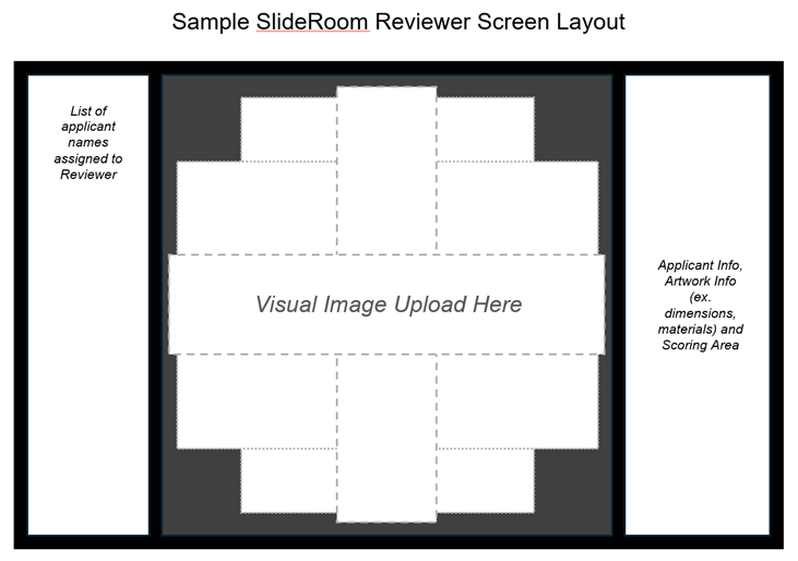
Here is an example of a SlideRoom review screen layout, so that you can visualize the way your uploads look on the evaluator end:
In taking all of the above information into consideration, we hope that this helps you better understand why a presentation layout is not preferred. Here is an example of presentation layout:
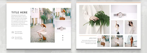
The insets end up showing very small on screen, which makes it hard for evaluators to see details.
Both the Art and Design|Media Arts departments do NOT want to see this layout.
CONSIDERATIONS OF 3D WORK:
EXAMPLE 1: A sculptural assemblage made by Betye Saar, from an exhibition catalog for the Los Angeles County Museum of Art:
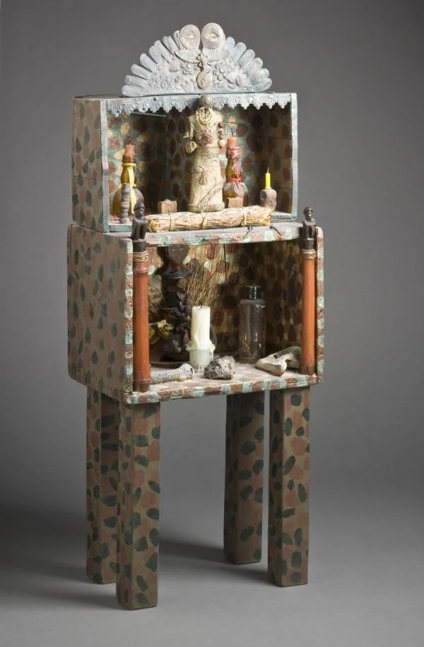
Keep in mind that the evaluators are all visual artists and are experienced in looking at work. In this case, do you think that one single large image is sufficient? Do you think that a detail shot is necessary in order to understand what the artist is trying to convey? Do we need to see the back of the piece? Why or why not?
EXAMPLE 2: An installation piece by artist Michael Murphy. Here are two different perspectives of a single installation:

(source: https://dustyoldthing.com/incredible-illusion-sculptures/)
For this work, different angles and perspectives are critical for understanding the message. Do you think that it’s worth taking up two or more JPEG uploads to feature the work, or could you combine these two images inset into a single JPEG? Maybe this might be a place to utilize the Optional Multimedia and upload a video that is a 360-degree walkaround of your piece?
CONSIDERATIONS OF DIPTYCHS/TRIPTYCHS:
EXAMPLE: “Wavy Horizontal Lines/Diptych” by Sol LeWitt. Diptych/triptychs are not “split screens”, but a single artwork that involves multiple panels, so it is okay to have a single JPEG image of a diptych/triptych.

CONSIDERATIONS OF CONNECTED THEME, MANY MEDIUMS:
EXAMPLE: A painting and a sculpture by Vasa Mihich. On the left, “Untitled C.286”, acrylic on canvas on plywood, 2007. On the right, “Sunshine Cube”, acrylic, 1987.

EXAMPLE: Lee Bontecou. “Untitled, 1961”, sculpture (Left), “Untitled, 1958”, drawing (Right).


For both examples, even though the pieces are conceptually related, they are still two distinct pieces. In this situation, it would be more appropriate to upload them as individual JPEGs, with the work filling the entire frame of the image so that evaluators can get an accurate sense of scale, dimension, and detail.
ADDITIONAL EXAMPLES:
Alida Sun (code art, installation, light art, architecture, choreography). This article is a good example of multiple pieces from one artist that show up in vastly different mediums, but how all of the pieces can stand on their own.